card
content and footer are raw HTML slots — they pass through as-is. Wrap user-supplied values in escHtml() before composing them into the string.
Recent activity
No activity in the last 7 days.
card({
  title:   'Recent activity',
  content: `<p class="u-text-muted u-text-sm">No activity in the last 7 days.</p>`,
  footer:  button({ label: 'View all', href: '/activity', variant: 'ghost', size: 'sm' }),
})
With image
Use flush to remove body padding, then add an image at the top and restore padding on the text content below it.
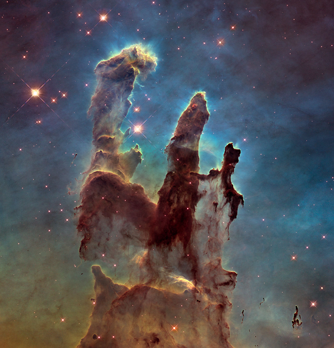
Deep field
The Pillars of Creation, imaged by the Hubble Space Telescope.
card({
  flush: true,
  content: `
    <div class="u-overflow-hidden" style="height:180px;border-radius:var(--ui-radius) var(--ui-radius) 0 0">
      <img src="/img/nebula.jpg" alt="The Pillars of Creation in the Eagle Nebula" style="width:100%;height:100%;object-fit:cover">
    </div>
    <div class="u-p-5">
      <p class="u-font-semibold u-mb-2">Deep field</p>
      <p class="u-text-muted u-text-sm">The Pillars of Creation, imaged by the Hubble Space Telescope.</p>
    </div>
  `,
  footer: button({ label: 'View gallery', href: '/gallery', variant: 'primary', size: 'sm' }),
})
With badges
Compose badge() inside content to show status labels or category tags.
API rate limits
Requests are capped at 1,000/min per API key. Contact support to increase your limit.
card({
  title:   'API rate limits',
  content: `
    <div class="u-flex u-gap-2 u-mb-4">
      ${badge({ label: 'Production', variant: 'success' })}
      ${badge({ label: 'v2.1',       variant: 'info' })}
    </div>
    <p class="u-text-muted u-text-sm">Requests are capped at 1,000/min per API key.</p>
  `,
  footer: `
    ${button({ label: 'View docs',        href: '/docs',    variant: 'ghost',     size: 'sm' })}
    ${button({ label: 'Request increase', href: '/contact', variant: 'secondary', size: 'sm' })}
  `,
})
With metadata row
A flex row inside content works well for author, date, read-time and similar metadata.
Building with Pulse
Learn how to scaffold a new project and ship your first spec-driven page in under ten minutes.
card({
  title:   'Building with Pulse',
  content: `
    <p class="u-text-muted u-text-sm u-mb-4">Learn how to scaffold a new project...</p>
    <div class="u-flex u-gap-3" style="align-items:center;flex-wrap:wrap">
      <img src="/img/avatar.jpg" class="u-rounded-full" style="width:28px;height:28px" alt="">
      <span class="u-text-sm u-text-muted">Jane Smith</span>
      <span class="u-text-sm u-text-muted">·</span>
      <span class="u-text-sm u-text-muted">Mar 15, 2024</span>
      <span class="u-text-sm u-text-muted u-ml-auto">5 min read</span>
    </div>
  `,
  footer: button({ label: 'Read article →', href: '/blog/pulse', variant: 'ghost', size: 'sm' }),
})
Stat / metric card
Cards without a title work well as simple metric tiles. Use grid() to lay multiple cards out side by side.
Total revenue
£48,295
↑ 12% this month
Active users
3,842
Across all plans
Churn rate
1.4%
↑ 0.2% vs last month
grid({
  cols: 3,
  gap: 'sm',
  content: [
    card({
      content: `
        <p class="u-text-muted u-text-sm u-mb-1">Total revenue</p>
        <p class="u-text-3xl u-font-bold">£48,295</p>
        <p class="u-text-sm u-text-green">↑ 12% this month</p>
      `,
    }),
    card({ ... }),
    card({ ... }),
  ].join(''),
})
Grid inside a card
Components compose freely — pass a grid() into a card's content slot for structured layouts inside a surface.
Plan comparison
Starter
£0
Up to 3 projects
Pro
£12
Unlimited projects
Enterprise
Custom
SLA + support
card({
  title:   'Plan comparison',
  content: grid({
    cols: 3,
    gap: 'sm',
    content: [
      `<div class="u-text-center u-p-2">...</div>`,
      `<div class="u-text-center u-p-2">...</div>`,
      `<div class="u-text-center u-p-2">...</div>`,
    ].join(''),
  }),
  footer: button({ label: 'View full pricing', href: '/pricing', variant: 'ghost', size: 'sm' }),
})| Prop | Type | Default | Description |
|---|---|---|---|
title | string | — | Escaped automatically |
level | number | 3 | Heading tag for the title (1–6). Visual style is unchanged — use this to keep the document outline correct when the surrounding context already has an h2 or h3. |
content | string | — | HTML string — not escaped |
footer | string | — | HTML string — not escaped |
flush | boolean | false | Removes body padding — useful for full-bleed images or tables |
class | string | — |